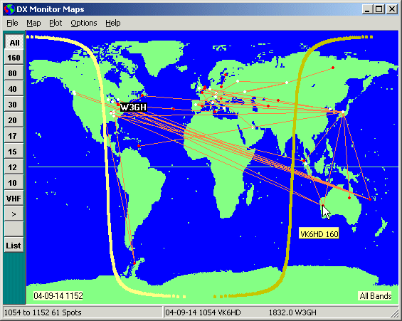
Map of Spots in the Last Hour
Maps
Map of Spots in the Last Hour
Maps are a great way to consolidate and display a lot of information in a concise manner that can be absorbed in a glance. DX Monitor displays both Azimuthal (Great Circle) and Mercator projection maps of the world and can plot spots and other information on both maps.
The example shows some of the features. Having just turned on DX Monitor, I want to see what the bands are like. A quick plot of the last hour shows that there have been 61 spots. If I am particularly interested in only one band, I can press one of the band buttons on the left to limit the display to that band. Moving the cursor over the map, the callsigns appear in a hovering yellow box and the latest spot is shown in the status panel at the bottom. W3GH spotted VK6HD on 160 at 1054z this morning. Too bad I'm a bit late, but tomorrow morning I think I will get up to catch the sunrise greyline propagation to VK.
On the west coast, a top band DXer looking at this map will think it might be an excellent
morning to try for 3B9 when the terminator reaches them both. Coming Soon:
The ability to enter a date and time and see the terminator. The ability to scroll the
terminator through a day to see how it lines up with different locations.
Click on a Spot
Double Click on a Spot to show all the history of the callsigns associated with that
spot on the map. If the Recent button is on, the information will
be for the last week. If not, the entire history file will be searched.
Clicking the map icon in the History Window will now show all the spotters.
Use the many features of the History Window to analyse the information.
Add Callsign to Location Database
If you know that a DX station is located in a different place than the one shown based on the prefix or Callbook data, you can specify the location for the purpose of showing it on the map and predicting propagation by right-clicking on the Mercator map and entering the callsign.
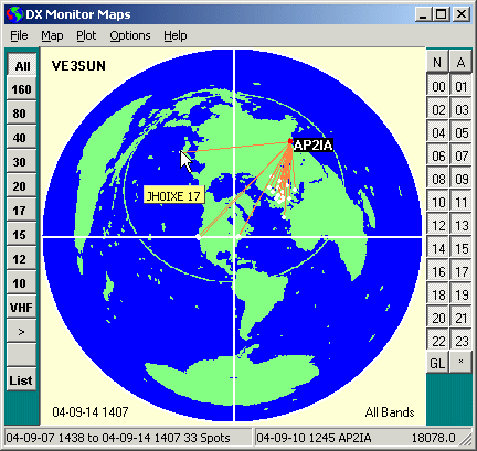
Map of spots of Pakistan this week.
AP2IA just showed up on 20 and I need AP on 17 meters. I right clicked on his call in the main window and selected the second item, Pakistan, which also shows the beam heading, distance and sunrise/sunset times. This listed all the spots of Pakistan stations in the History Window. Clicking the map icon produced the map shown above. I see that JH0IXE spotted him a few days ago. Now I know what time to check the bands. See also the Activity Plots which would show Pakistan activity in the past week by day or by hour.
 Band Buttons. Type Ctl-B or select Show Band Buttons from the Options Menu
to show the band buttons at the left of the Map Window.
The band buttons allow easy browsing of any map of spots by band.
Click on a band button to display only the spots on that band.
Click on the arrow button to scroll through the bands one by one.
Band Buttons. Type Ctl-B or select Show Band Buttons from the Options Menu
to show the band buttons at the left of the Map Window.
The band buttons allow easy browsing of any map of spots by band.
Click on a band button to display only the spots on that band.
Click on the arrow button to scroll through the bands one by one.
List button is used to list the displayed spots in the History Window allowing further analysis.
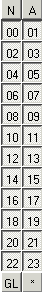 Hour Buttons. Type Ctl-H or select Show Hour Buttons from the Options Menu
to display hour buttons at the right of the Map Window.
The hour buttons allow browsing of spots on the map by UTC hour. This tells you the time
that stations are active and where they are being heard. Use the hour buttons and band buttons
together to investigate the activity from a country, a DXpedition, or during a period of time.
Hour Buttons. Type Ctl-H or select Show Hour Buttons from the Options Menu
to display hour buttons at the right of the Map Window.
The hour buttons allow browsing of spots on the map by UTC hour. This tells you the time
that stations are active and where they are being heard. Use the hour buttons and band buttons
together to investigate the activity from a country, a DXpedition, or during a period of time.
00 to 23. The hour button for each hour. When selected it shows as depressed. When deselected it shows as a flat button and spots from those hours are not displayed. Right Click on an hour button to show a popup menu choice: Radio Buttons. If this option is checked, the hour buttons work like “radio buttons”. Pressing one button, pops all the others. If not checked, it is possible to have multiple buttons pressed (and hours shown). Using other features turns off the radio button selection.
If the Show Terminator option is seleced in the Options Menu, pressing an hour button will show the Terminator (Greyline) on the map at the time indicated on the button plus 30 minutes. This is handy for looking at spots from Europe to predict propagation in North America in a few hours around sunrise or sunset.
N. This button clears all the hours so you may select one or two by clicking on them.
A. This button selects all the hours so all spots are displayed. When new data is mapped the A button is selected by default.
* Current Time. This button selects three hours around the present time. This is useful for checking who is often on at the time of day you are operating when history data is displayed.
GL. Greyline. This button selects the hours around your sunrise and sunset time. The map will show the current Terminator line across your location at sunrise (yellow) and sunset (brown). It has been observed that extraordinarily good propagation can occur along the Terminator line just at your local sunrise. This is known as Greyline Propagation. (Grayline Propagation in some countries).
There is also a significant enhancement of propagation on 160, 80 and 40, and sometimes other bands just after local sunrise (to the west) and just before local sunset (to the east). These are good times to be on the air and it is useful to see what stations are active at these times if you are looking for a new country.
If you would like to learn more, read N4KG’s article about SR/SS Enhancement and Grayline Propagation.
Animation Button. Press the > button to begin animating the map hour by hour. The delay between frames of the animation is set in the Options Menu and may be between 1 mSec and 60 seconds. Press the Animation Button a second time to stop the animation.
Pause Button. Press the Pause Button to pause the animation. Press it again to continue.
Saving Animations. Right click on the Animation Button or the Pause Button and select Save Animation to File ... from the popup menu. The 24 views of the map will be saved to a set of files with the hour in parentheses, e.g. Sunday Opening (12).gif. Use any commercial or freeware program to combine the images into an animated gif or avi file. If there is demand from registered users, I will add the code to create an animated gif directly.
|
Tip: If the map is fills the screen, the History Window can be accessed by pressing the F9 key. This is useful for toggling back and forth between maps and the History Window. |
Clear. Clear the map of all spots and data.
Save Image As ... . Save the displayed image in GIF or PNG format. PNG format will reproduce some colors more accurately. The saved image will be the same size as the image on the screen. Resize before saving if you have a particular purpose in mind for the saved image such as display on a web page.
Save List As .... Save the displayed data as a text file in the DX Monitor history format.
Plot History File. Load a saved DX Monitor history file or a file which has been converted into DX Monitor History Format. See the History Window for conversion capabilities from logbook files.
Close. Close the Map Window.
Azimuth (Great Circle) Map. Use the Azimuthal projection to show a map centered on your location. This is the view of the world as your beam sees it.
The first time the maps are used the Azimuthal Map will take longer than normal to appear as new maps are being generated for your particular location. Please be patient. Clicking again will restart the process.
Mercator Projection. Use the traditional Mercator projection to show a map of the world.
Land Color. Set the color used to show the land on the map. The political colors can be used to outlind different countries but a single dark color works best for viewings spots on the map.
For interesting presentation maps, the Satellite Photo can be used by selecting Use Satellite Photo as the land color. The sea colors will also be from the photo. Path and spot colors will have to be selected to make them visible against the blues and greens of the image.
Sea Color. The color to use for water on the map when using Political Colors or a custom land color.
Show Quadrant Lines. Optional. On the azimuthal projection map, some lines to help you visualize your beam heading. Note that if you change the shape of the window such that the map is not round, what looks like 45 degrees on the map will not be a 45 degree beam heading.
DX Color .... Set the color of the pins placed in the map for DX stations.
Spotter Color .... Set the color of the pins for the spotter stations. Because most locations are in the same spot, if you plot a lot of data, the spots will overwrite each other, so several spotters and dx stations may occupy the same spot, hiding the underlying color.
Path Color .... Set the color of the line drawn between the spotter and the DX stations on the map.
Path Width .... Set the width of the line drawn between the spotter and the DX stations on the map.
| Rainbow Filter | |
| 160 | Red |
| 80 | Orange |
| 40 | Yellow |
| 20 | Green |
| 15 | Blue |
| 10 | Violet |
If the filter indicates that certain frequencies should be hidden, no path will be drawn. This can be useful to show the DX on the band and highlight certain bands or frequencies of special interest or which are legal for you.
The Filter Editor window can be opened beside the map as a legend to the meaning of the colors by selecting Edit Filters from the submenu.
After editing the current filter, the changes will not take effect until the filter has been reloaded. Select a different filter, then re-select the filter you want to use to force the changes to take effect.
Color Path by Frequency - Enable. Toggles the use of the color filter or the default Path Color set by the menu above.
Color Path by Frequency - Edit Filter. Edit the current filter or create a new filter using the Filter Editor. As the colors can be specified by frequency, special filters can be created for different purposes with different colors for CW, SSB, IOTA frequencies or other frequency dependent groups.
Color Path by Frequency - Select Filter. Select any of the available filters to use as the color scheme.
Generate New Map. This forces the program to create a new map. In general it should not be necessary to use this command as new maps are generated when needed. But for the beta release, you might find this useful. The first time an Azimuthal map is generated it may take a few seconds (depending on the speed of your computer). The map for that location and color scheme is saved in the Maps Folder in the DX Monitor folder of Program Files and is loaded automatically to save generating a new map every time the program is run.
Last 20 Minutes. Plot all of the spots that have occurred in the past 20 minutes. Depending on the setting of the options, the DX station, spotting station, and a line between them will be shown.
Last Hour. Plot all of the spots in the past hour.
Automatic Refresh. If selected, the map will be updated once a minute with the latest spots in the
past 20 minutes or hour depending on the selection above. Automatic Refresh will be turned off when
other plots are done on the map to avoid overwriting them. (May not be fully implemented - turn off if necessary).
Convolve as Local Prediction
Set Convolve Latitude Range.... By default, the convolve operation will show all paths which end within 6 degrees of your latitude. You can show fewer paths by reducing this range. Remember that the north pole may move by one degree of latitude in 12 hours, so there is no point in trying to be too accurate.
Plot Terminator for date - time. When studying old logs or DX spots it is useful for understanding to see the grayline terminator on the map at the time in question. This command allows you to plot the terminator at any date or time.
Show all IBP beacons. Show all 18 of the NDXF/IARU International Beacon Project Beacons on the map.
Show Transmitting Beacons. Show the currently transmitting beacons in the network. Five beacons are shown at once with the band and callsign on the map. Your computer clock needs to be accurate to within a few seconds for this map to be useful. See the Internet Time Window.
Recalculate Spot Locations. Forces the recalculation of spot locations on the map. This may be necessary after resizing the map in the beta version.
Refresh F5. Refresh the map display. Normally this occurs automatically when the data or the display window have changed. It may be necessary in the beta version if there are glitches.
Show Terminator (Greyline) ctl-T. Option to show the terminator line between night and day on the map. Sunrise is yellow. Sunset is brown.
Show DX. Option to show a dot for the location of each DX station using the color selected in the Map Menu.
Show Spotters. Option to show a dot for the location of each spotter using the color selected in the Map Menu.
Show Paths. Option to show a line between the spotter and the DX station. These lines are not the true paths followed by the signal.
Show Band Buttons ctl-B. Show the band filter buttons on the left. If the buttons are hidden, All Bands is selected automatically.
Show Hour Buttons ctl-H. Show the hour filter buttons on the right. If the buttons are hidden, All Hours are selected automatically.
Set Animation Speed .... Enter a pause time between frames of an animated map view. The value may be between 1 mSec and 60000 mSec (60 seconds).
Set Caption .... Set a caption for the map. Before saving the map, it is useful to annotate it with a short caption. The caption will appear in the lower left corner of the saved map.
Copy Maps to Desktop Wallpaper. New maps are periodically copied to the desktop as wallpaper so that if you minimize all your programs you can watch the map to see what is going on on the bands. When you quit DX Monitor, your old Wallpaper will return. Many users use this as a kind of screensaver with DX Monitor minimized and watch the map for new activity.
Show When Auto Button is Pressed. If selected, pressing the Auto button in the main window will automatically display the map window and enable Automatic Refresh at the rate selected in the Plot Menu.
Help Menu
Help displays this Help page using your default web browser.